Understanding the Brand Sales Analytics Dashboard
5.9 min read
|This article is applicable for users with Order Management access.
Overview
Brand Sales Analytics is designed to provide both a high-level and in-depth view of your current sales performance compared to previous periods.
Giving users access to the dashboard
By default, only System Admins have access to the Sales Analytics Dashboard. To give access to other users, you need to give them the analytics permission.
- Click Users on the left navigation menu.
- Select the user you want to give access to.
- Click Edit.
- Click the Analytics checkbox.
- Click Save.
The Hub Analytics Snapshot
The Sales Analytics experience begins when you login to the Hub. You will see six sales data visualizations in the Analytics Snapshot after login. To see the full Sales Analytics Dashboard, you can click on the ‘More’ button or click on the ‘Analytics’ app icon.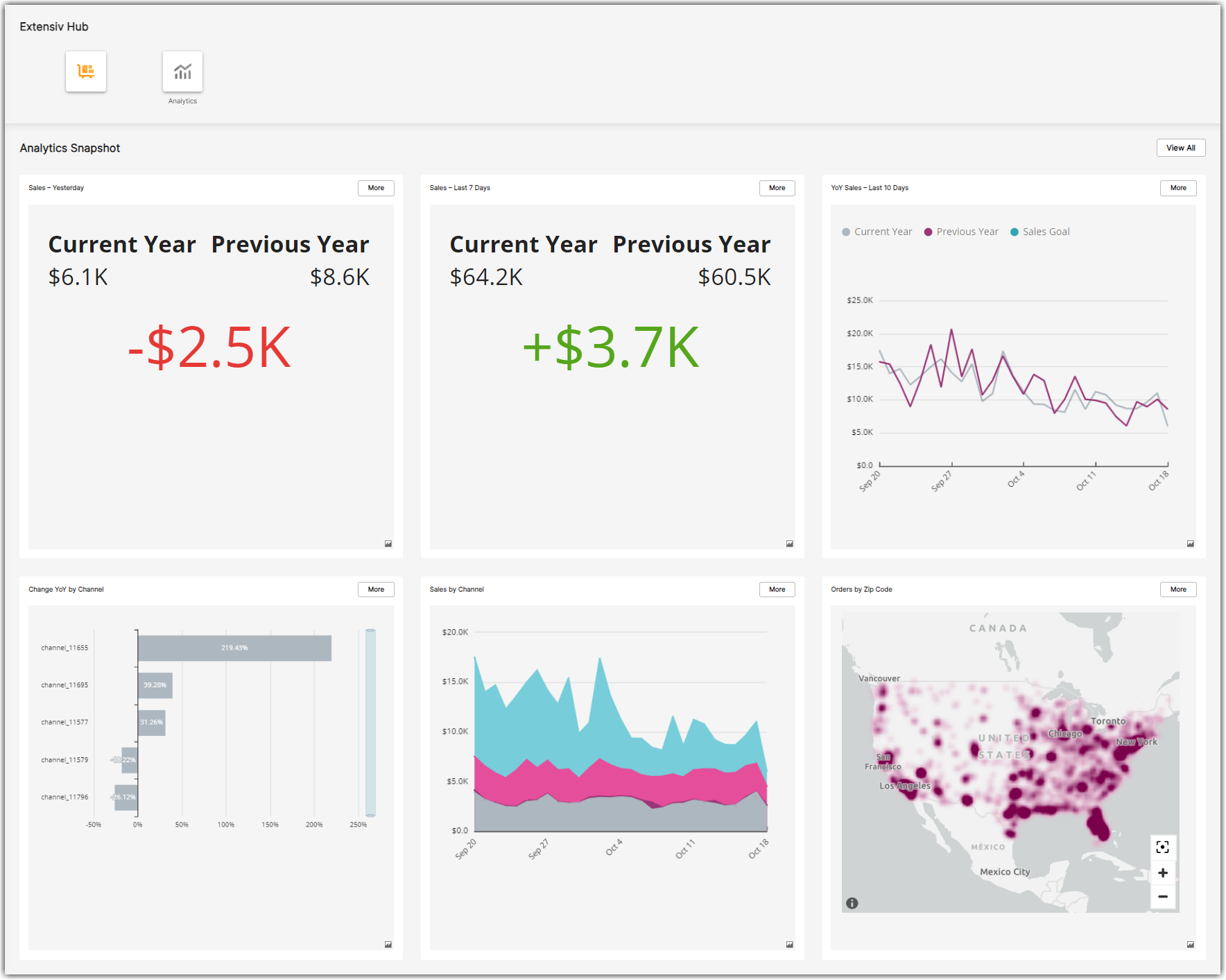
The Sales Analytics Dashboard
This dashboard currently includes four tabs or sheets, each with multiple data visualizations.
- Summary – provides overall year-over-year sales comparisons for different periods, by sales channel, and by geographic area.
- Sales Trends – provides sales comparisons over multiple years and over a longer period of time.
- Channel Sales – provides gross and net sales analysis by channel.
- Product Sales – Compares year-over-year changes in sales to specific product and product categories.
- Orders – provides detailed analysis of order value, items per order, order status, aging, and type.
- Fulfillment – Provides a geographic view of sales across your fulfillment network.
New – Sales Metrics Parameter Selection
The new Sales Metric Parameter in each dashboard sheet that enables you to see sales by:
- Dollar Amount – The sales amount in dollars as modified by the sheet filters to include or exclude tax, discounts, shipping fees, etc.
- Orders – Sales by the quantity of orders
- Units – Sales by the quantity of units sold
The Sales Metric Parameter impacts all KPI and chart/graph visuals but does not impact tables that are designed to show specific dollar amounts. This new parameter also replaces year-over-year comparisons by percentage. Now, all year-over-year comparisons are absolute based on the selected parameter.
How Sales Data is Calculated
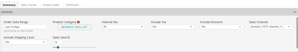
The base sales data for an order is calculated on the price of items in an order multiplied by the quantity of the items. Filters on each sheet allow you to select which other revenue components to include in sales data:
- Include Discount
- Include Tax
- Include Shipping Fee
Year-over-year data is calculated based on the same actual day of the week in the previous year, using the ISO 8601 standard. For example, sales on Thursday, September 21, 2023, are compared with Thursday, September 22, 2022. This type of comparison enables apples-to-apples comparisons of specific days of the week and weeks of the month. Some holidays, like July 4th, do not fit neatly into this type of analysis so you’ll need to consider that when comparing some holidays year-over-year.
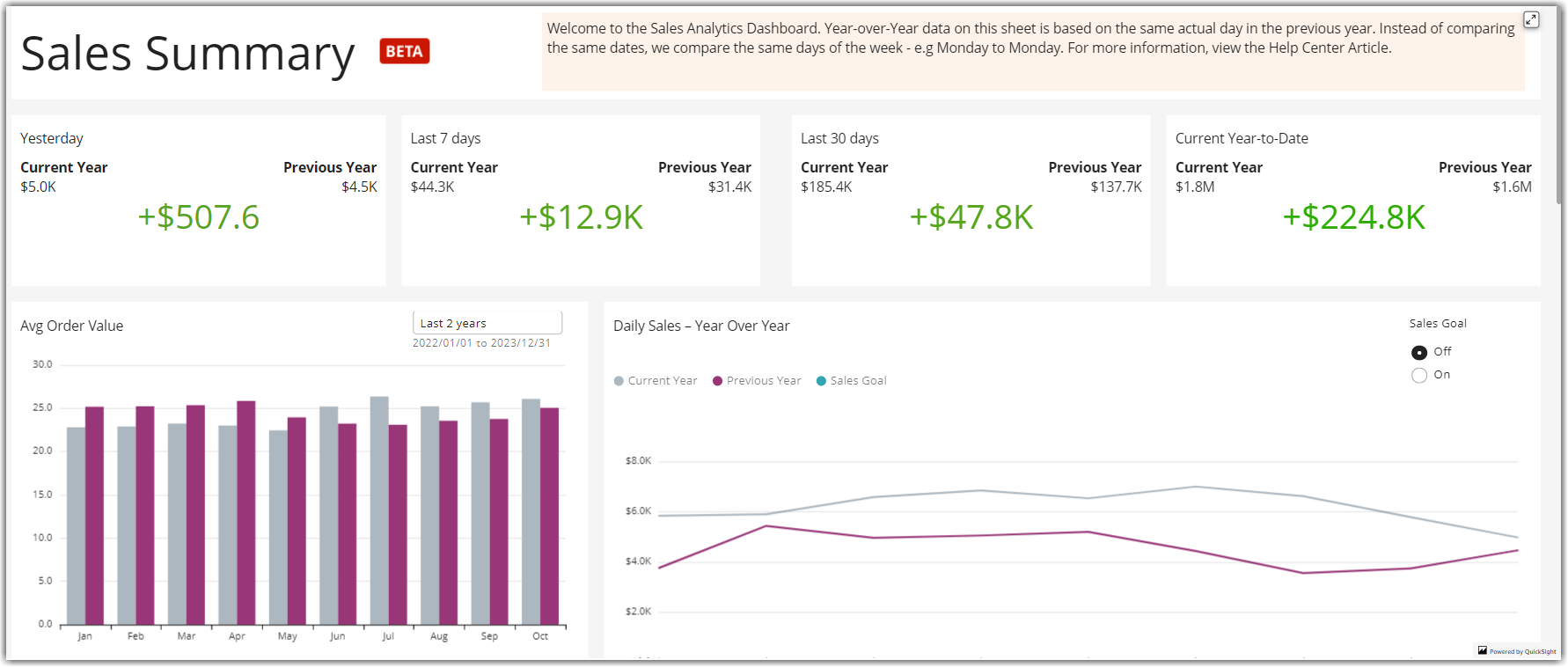
The Summary Sheet
The top row of visuals provides at-a-glance, year-over-year comparisons based on different periods. You can quickly see if sales were up or down compared to the same period last year.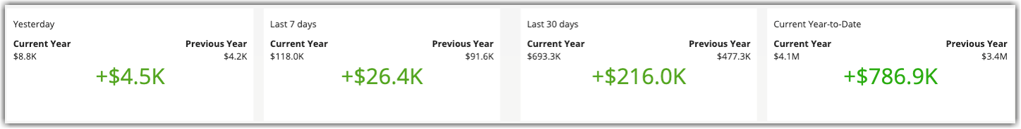
Daily Sales – Year Over Year
This shows a line graph of sales over the date range configured in the sheet filters for the current and previous years. You can also set a percentage-based sales goal in the filters and turn that on to visualize a goal target for the current year.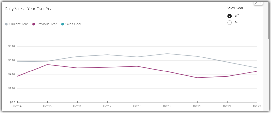
Orders by Zip Code
Shows a heat map of sales activity by zip code over the date range configured in filters. There is a more detailed map of Sales by Zip Code by Fulfillment Warehouse in the Fulfillment Sheet.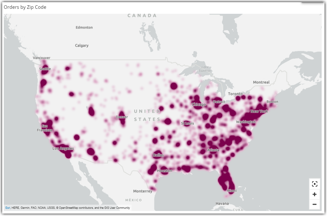
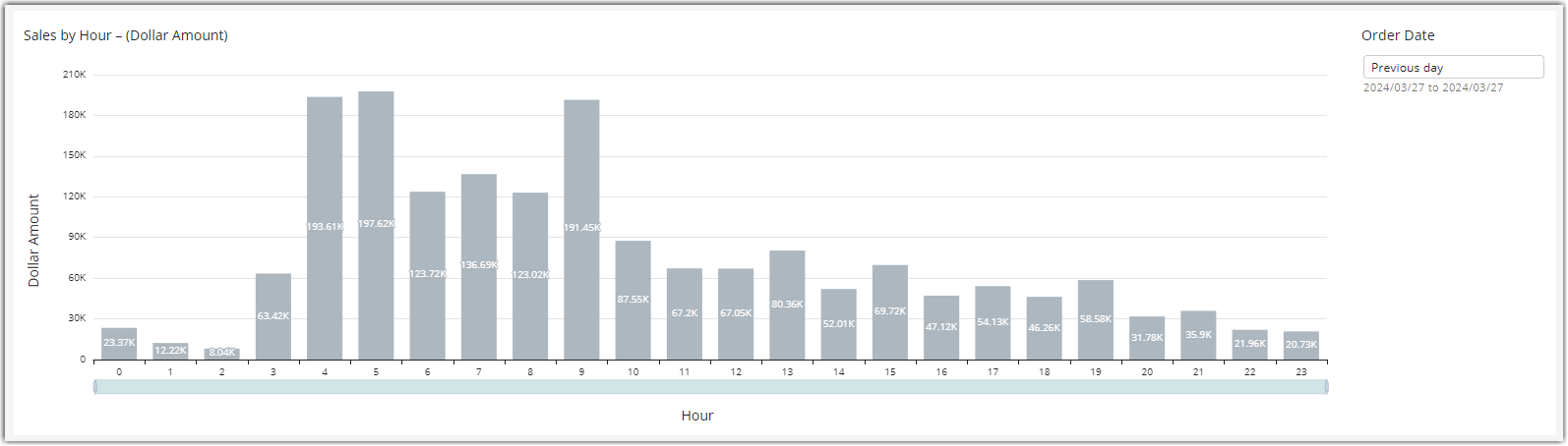
New – Sales by Hour on a Previous Day or Date Range
This visual shows sales by hour of a specific day in the past or over a date range. Sales figures are based on the Sales Metric Parameter in the master sheet filters – Dollar Amount, Orders, and Units. By default, this visual shows sales by hour for the previous day. Use the date filter in the upper right corner of that visual to choose a different day in history or select a date range to see a broader picture of sales by hour over multiple days.
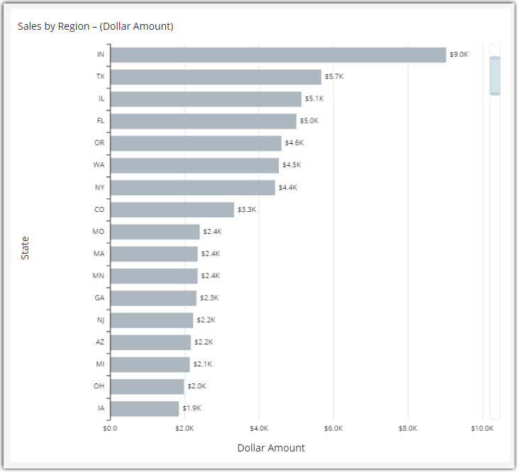
New – Sales By Region
This visual starts at the State/Province level but allows you to drill into the city level by right-clicking on a State bar (to see sales by cities in that state) or by clicking on the drill-down arrow at the top of the visual to see a view of sales by cities in any region.
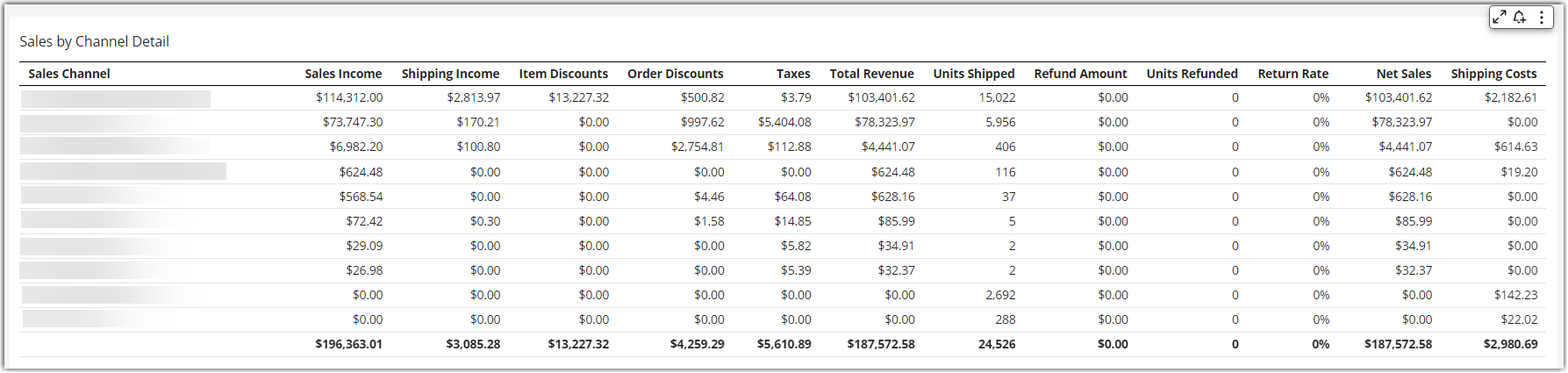
New – Sales by Channel Detail
This table includes columns for Refund Amount, Units Refunded, Return Rate, Net Sales, and Carrier Costs. Refund Amount enables the Net Sales calculation using the following algorithm: Net Sales = Gross Sales – (discounts + refunds).
Sales Trends Sheet
These visuals provide sales comparisons over multiple years and over a longer period of time.
Year-to-Date and Month-to-Date Sales
These visuals compare changes in sales between the current period and the exact period in the previous year.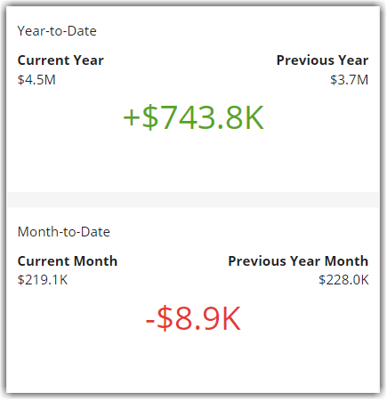
Historical Sales
This show month by month sales for multiple years. You can configure the number of years to compare in the Sheet Filters.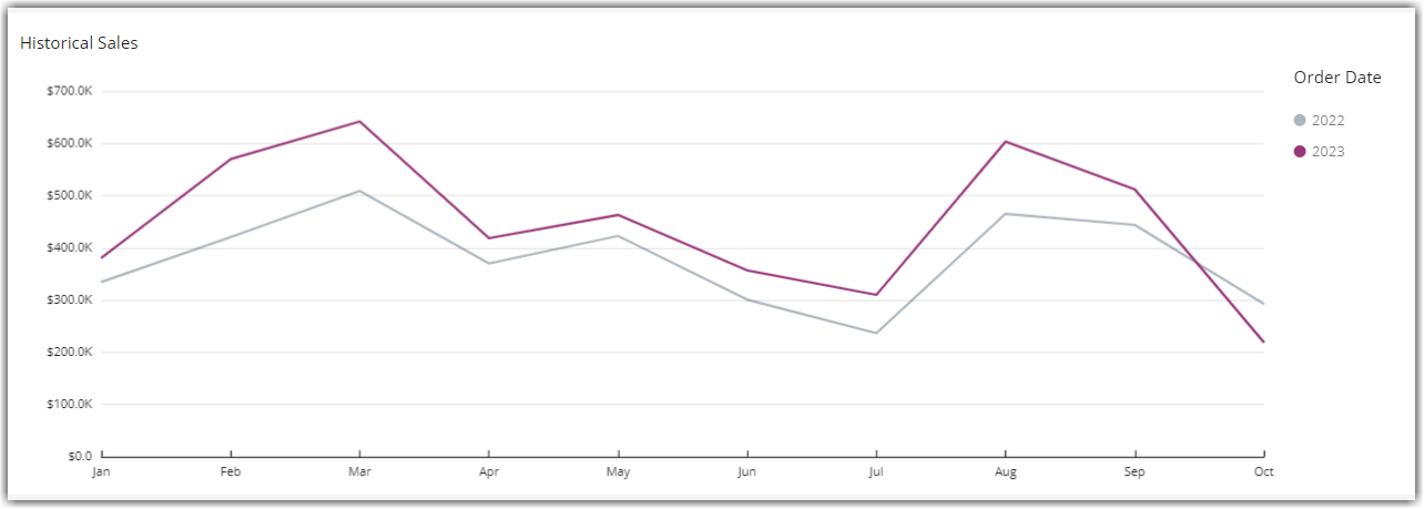
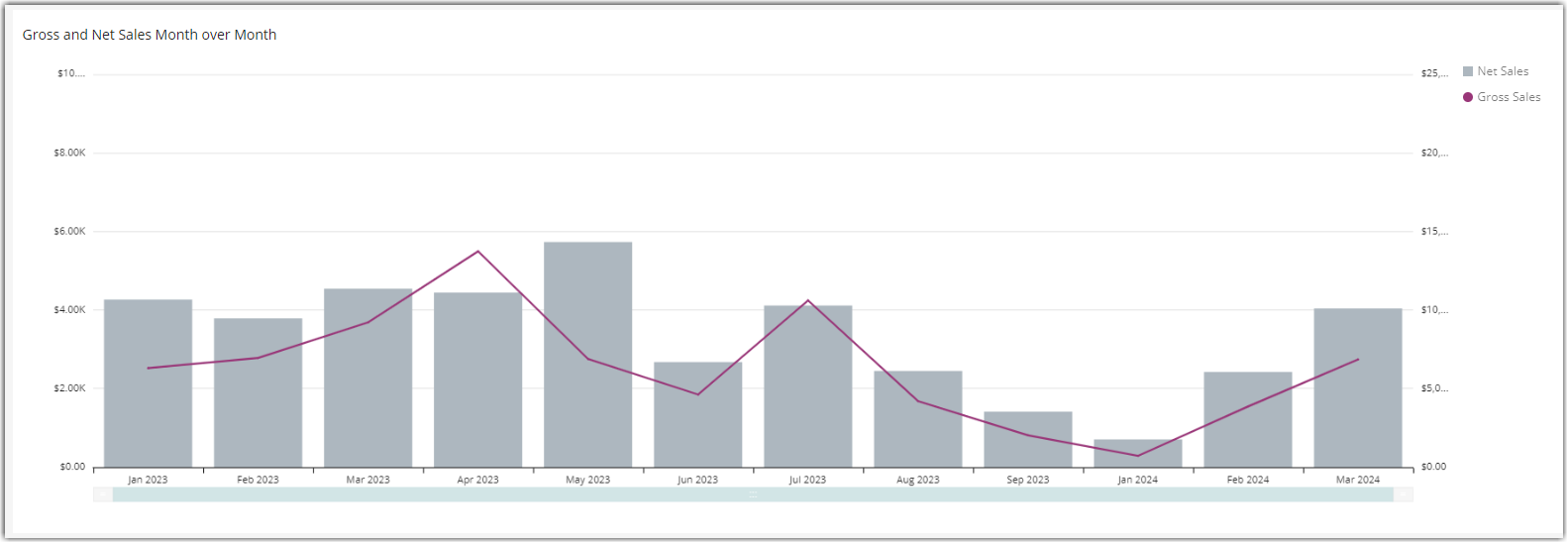
New – Gross Versus Net Sales – MoM
This combo chart shows gross and net sales month-over-month. Net sales are calculated as follows: Net Sales = Gross Sales – (discounts + refunds).
Sales Details
This table shows the sales actual transactions based on what you have selected in the other visuals. For example, if you want to see sales for a specific month and year, you can click on a point in the Historical Sales line chart that corresponds with a specific year.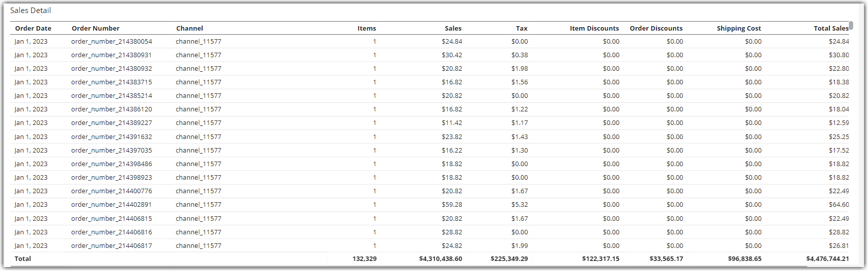
New – Channel Sheet
Sales Channel Trends
The Sales Channel Comparison by Year visuals compares current month-to-date sales for the current year to equivalent periods in previous years. The Sales by Channel visual shows a stacked area graph month by month for the current year. The sum of the stacked areas is equivalent to sales for all channels selected in the sheet filter.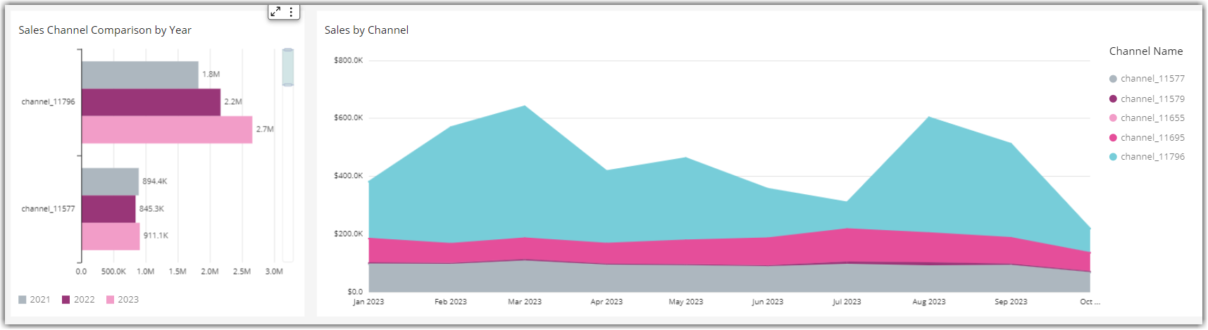
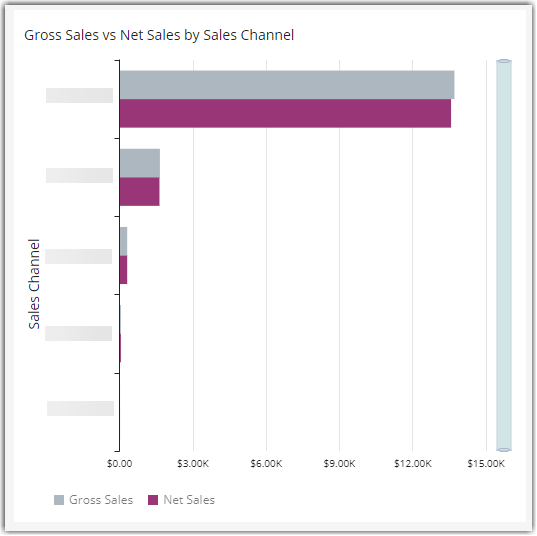
New – Gross Versus Net Sales by Channel
This visual shows a gross versus net sales comparison by channel for the selected date range.
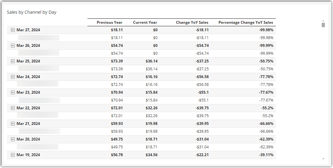
New – Sales by Channel by Day
This is a Pivot Table that shows sales by channel per day, for the current and previous year. This is designed to help you identify significant changes in a channel in a given day to potentially identify issues or opportunities.
Product Sales Sheet
These visuals provide a view of changes in year-over-year sales with specific Master SKUs, Listing SKUs, and product categories. Clicking on products or product categories in the horizontal bar charts will filter all of the other visuals on the sheet to show sales just for the selected items.
Overall Year-over-Year Comparisons
These visuals are similar to the summary sheet but they are filtered by the products or product categories selected in the horizontal bar charts.
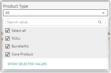
New – Product Type Filter
This enables you to filter visuals on the sheet by Product Type, including Kit/Bundle or Core product.
New – Sales by Hour on a Previous Day
This visual shows hourly sales on the selected day or date range based on your sheet filters. Use the Product, Master SKU, or Listing SKU sheet filters to view sales by hour for specific products. By default, this visual shows sales by hour for the previous day. Use the date filter in the upper right corner of that visual to choose a different day in history or select a date range to see a broader picture of sales by hour over multiple days.
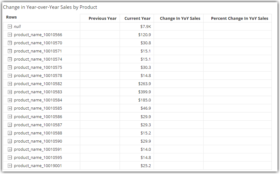
Year-over-Year Changes in Product Sales
These visuals measure percent changes in Product Categories, Products (Master SKUs), and Listing SKUs.
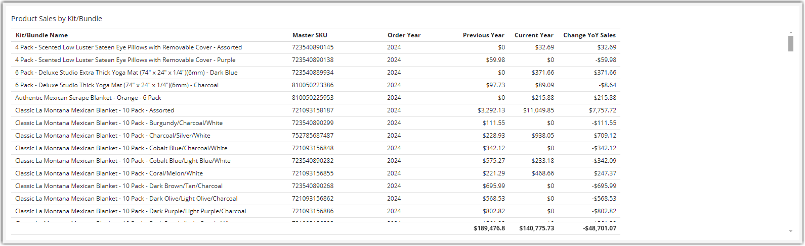
Product Sales by Kit/Bundle
This table provides a YoY comparison of sales by Kit/Bundle based on your sheet filter settings.
New – Orders Sheet
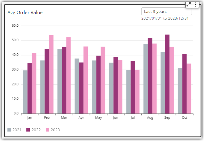
Order Metrics
These visuals show multi-year trends in average order value and average items per order. Comparing these two visuals help you identify if order value is going up or down because of pricing or because of the average items per order. You can configure the number of years to compare in the Sheet Filters.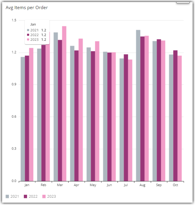
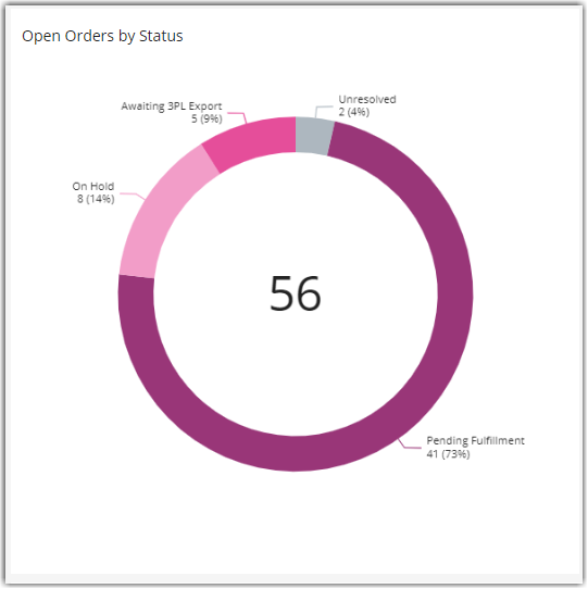
New – Open Orders by Status
This is a donut chart that shows open orders by status. You can click on a segment of the donut chart to filter the Order Details table below to see the actual orders represented in that status.
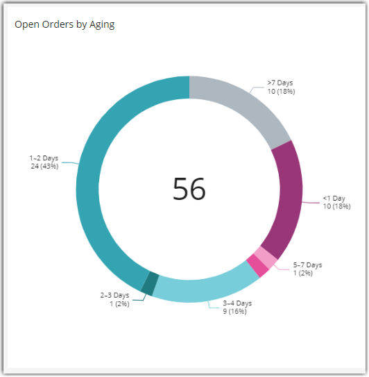
New – Open Order by Aging
This is a donut chart that shows open orders by aging. You can click on a segment of the donut chart to filter the Order Details table below to see the actual orders represented in that aging category.
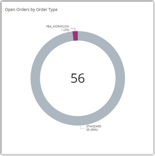
New – Open Orders by Order Type
This is a donut chart that shows open orders by type. You can click on a segment of the donut chart to filter the Order Details table below to see the actual orders represented in that type.
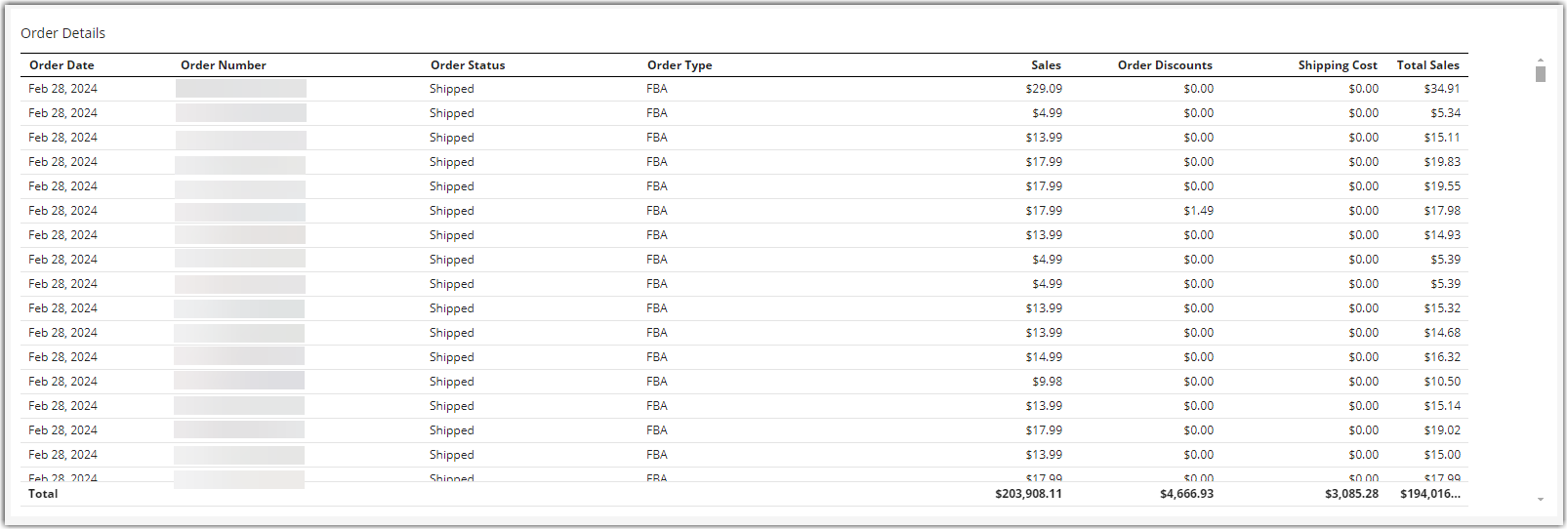
New – Order Details
This table shows the order of detail based on the selected date range and the selected visual segments.
Fulfillment Sheet
These visuals provide a geographic perspective on sales as well as an indication of your fulfillment network efficiency.
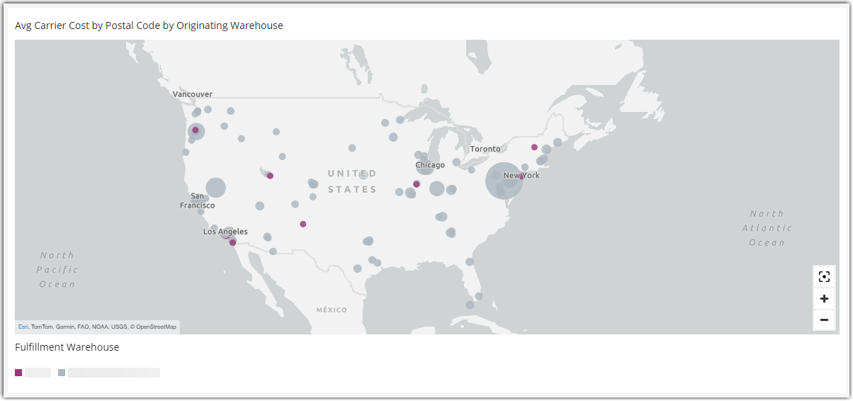
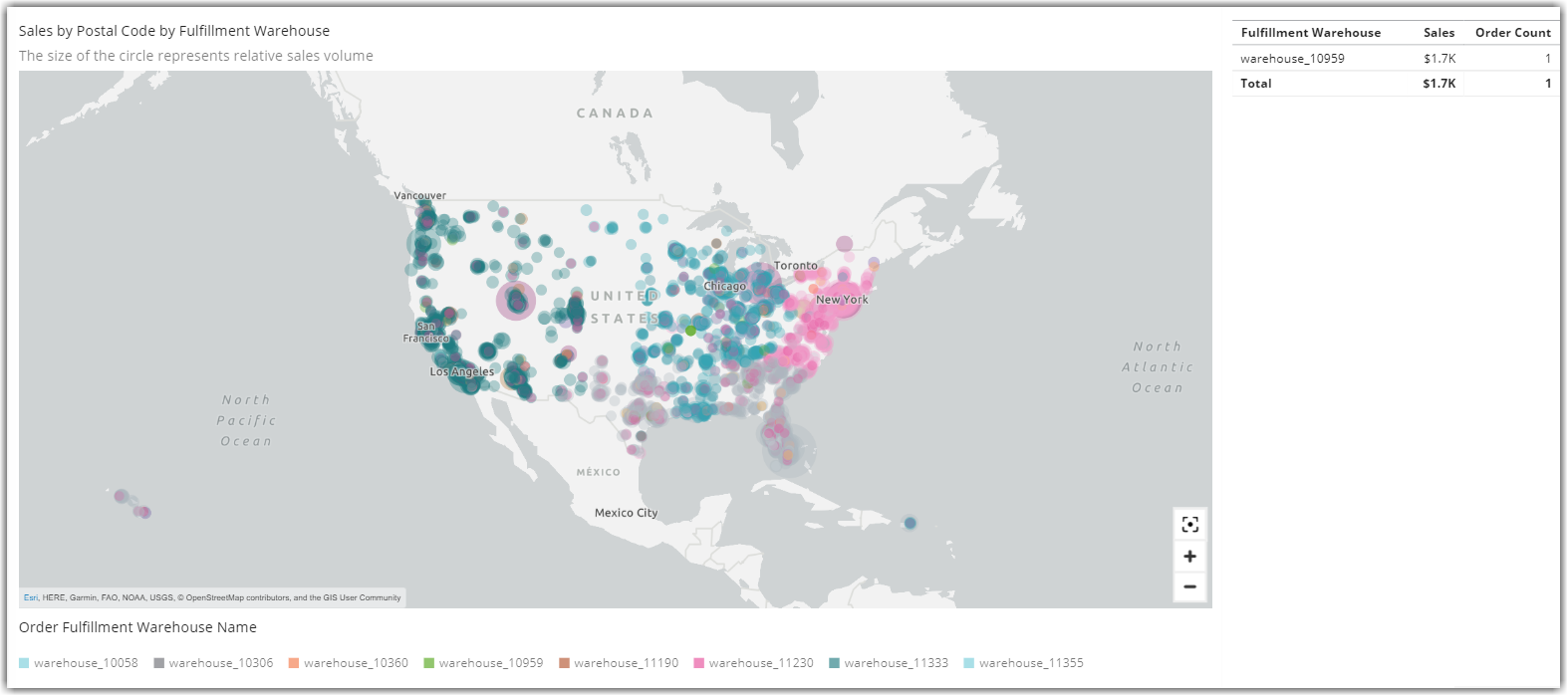
Sales by /zip Code by Fulfillment Warehouse and Order Detail
The map plots sales by Zip Code and is color-coded by the originating warehouse for the date range selected. The size of the circle represents the relative size of sales to a zip code. By clicking on a warehouse name in the table to the right of the map, you can filter the map by that warehouse, giving you a picture of the reach or efficiency of shipping from that warehouse.
Clicking on a dot on the map filters the Order Detail table (below) to show just the orders from that zip code.
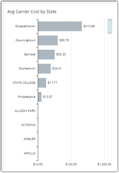
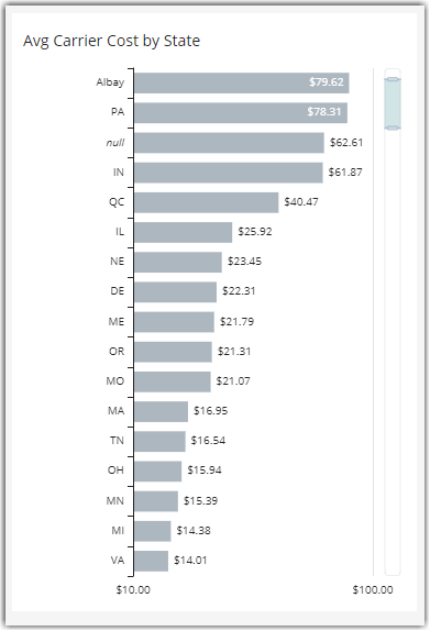
Avg Carrier Fee by Region
This visual starts at the state/province level but allows you to drill into the city level by right-clicking on a state bar or clicking on the drill down arrow at the top of the visual to see a view of average Carrier Fees by city.
Avg Carrier Fee by Postal Code and Originating Warehouse
This map provides visual insights into regions with higher or lower relative shipping costs. It is a valuable indicator of the efficiency of your fulfillment network and can identify opportunities to partner with 3PLs in the Extensiv Fulfillment Marketplace.